"A portrait is not a likeness. The moment an emotion or fact is transformed into a photograph it is no longer a fact but an opinion. There is no such thing as inaccuracy in a photograph. All photographs are accurate. None of them is the truth." - Richard Avedon

Wednesday 31 March 2010

Evil Being

The following images are my five favourite from the shoot. I feel that this shoot went really well and I am really happy with how the images turned out. I am feeling more confident in the studio now and I think that this shows in the photos which I have taken. To see the rest of the shoot click here.
I feel that these images have a great eerie feel to them and I have definatly achieved what I originally set out to do. The model looks evil in these images, but not so much that it made her look ugly. I used black eyeliner and eyeshadow on the model around her eyes and on her cheek bones to make her look darker. In photoshop I then darkened the black make-up further as the light made it look a more brown colour than the dark black that I wanted to achieve. The only thing which I change on these images was the contrast and the saturation. First I desaturated the images to make the models skin to make her look more lifeless and I then increased the contrast too make the images darker as the studio light made the images look slightly lighter than I wanted.

Taken: 11th March 2010

Taken: 11th March 2010

Taken: 11th March 2010

Taken: 11th March 2010

Taken: 11th March 2010

Thursday 25 March 2010

Week 5 - Studio #2

For my fifth week I have decided to revisit the studio but this time I am doing a shoot which is a complete contrast to the last studio shoot which I did. This time I will be using inspiration from a photoshoot which I saw on Americas Next Top Model which shows the contestants modelling as strange and evil beings. Unfortunatly when I try to upload the images on here for you to see they won't load so I have uploaded them to my photobucket account for you to see. http://s650.photobucket.com/albums/uu224/jadeybubbie/ANTM/
The model which I will be using for this shoot is Harriett from my tutor group. I decided to use her as normally she comes across sweet and innocent and I wanted to show a different side of her. From this shoot I am hoping to get about 30-40 images which I can then choose my favourite 5 from.

Tuesday 23 March 2010

My Joiners, Stitches and Montages

After Arlo's lesson I went home and decided to take some more of my own images to create a joiners, stitches and montages. For my joiner I took images of my boyfriends Ibanez guitar.The final image is made up of about 25-30 smaller images, which took me about 1-2 hours to join up, and I think that it came out really well. This joiner is definatly my favorite of the lot.
The second joiner which I created at the weekend was of my boyfriends bedroom wall. The final image was also made up of about 25-30 smaller images but this joiner was harder to create as I was trying to line up the posters on the wall but because they were all taken at different angles this was difficult. This is why the image is so juttery and why in some places there are two or three of the same things.
After creating these two images I decided to try and create some photo stitching. I used two different panoramic image sets. The first images that I took were of the college canteen which I took during Arlo's lesson and the second is of a panorama of Chapel Porth beach.
I found stitching the canteen together was easy as most things joined up well but the beach one was hard as the tide was changing throughout and the colour of the sky changed with the sunset.
In Arlo's lesson I also had a go at creating another joiner but of Harriet this time, I also did a photo montage of a Ford car. The image of Harriet was fun to create and the final image came out quite surreal. I like how her head is huge compared to her body and her legs are tiny. Originally with the Ford images I wanted to create a joiner but the images didn't match up enough to create one so I made a montage. I think that this works very well as the images are seperated by a white border and thick white lines which makes it more crisp and clean.

David Hockney


About David Hockney
David Hockney has often been regarded as a playboy of the art world. He has had lascivious relationships, and he has run among strange and crazy artistic circles. Yet he has always retained a sense of stability in his life through his constant and tireless devotion to his work. Hockney is an artist that has always enjoyed success and praise, facing little to no hardship in his career. What is interesting about his life is not the problems he has encountered, but the strides he has taken to bypass much human suffering and malaise.

David Hockney was born on July 9, 1937, in Bradford, England, to Laura and Kenneth Hockney. The Hockneys were, as David said, a "'radical working-class family.'" Laura and Kenneth were solid parents who only wanted their children to have the best education possible. Laura raised her children as strict Methodists and resolutely shunned smoking and drinking in the home. Kenneth was a passionate radical and a conscientious objector during World War I. David Hockney was always considered an eccentric in Bradford. He never really cared what people thought of him and always did as he pleased. He spent afternoons at Sunday School drawing cartoons of Jesus, much to his teachers' dismay. As a young child, Hockney also developed an obsession with opera when he first saw the Carl Rosa opera company's production of La Bohème.
In 1948, David Hockney won a scholarship to the Bradford Grammar School, one of the best schools in the country. Here he enjoyed his art classes most and thus decided that he wanted to become an artist. Furthermore, he disliked the other subjects he was required to study. In 1950, he asked to be transferred to the Regional College of Art in Bradford so that he could more seriously pursue his interest. However, the headmaster recommended that he first finish his general education before transferring anywhere. Hockney responded with misfit behavior towards his teachers and poor grades, even though he had found much success in school before this. He spent his class time doodling in notebooks. Nonetheless, his artistic leanings also won him prizes and recognition, and he drew comics for the school newspaper. Overall, he was a likeable and intelligent student with many friends.
In 1953, Hockney finally enrolled in the College of Art and began painting with oils, his medium of choice for most of his life. Hockney learned that painting was a process of seeing and thinking, rather than one of imitation. His artwork was abstract and quite personal and allowed him to deal with human sexuality and love in a public, yet still inhibited manner. He developed a penchant for painting mirrors and loved the artwork of painters such as Francis Bacon and other contemporaries. Socially, he made a lot of friends, but never really expressed any sexual interests. His group of acquaintances would often travel into London to catch various art shows. In the summer of 1957, Hockney took the National Diploma in Design Examination. He graduated with honors and then enrolled in the Painting School of the Royal College in London two years later, where and when he would gain national attention as an artist.
Hockney immediately felt at home at the Royal College. There were no steadfast rules or regulations. Not only did he find much success and pride in his work, but he also thrived in the many friendships he made there. He and his friends spent much of their time in the studio, but they explored the pubs and coffee bars around town as much as possible. Hockney was a serious student, however, and dedicated much effort to painting. During his first term, he experimented with more abstract styles, but he felt unsatisfied with that work, and he still sought his own style. His professors were good and receptive to his artwork, but Hockney seemed to learn the most from his fellow students who shared similar artistic interests and insights. Furthermore, he was quite a self-motivated sort of person and began to feel a need for meaningful subject matter, and so Hockney began painting works about vegetarianism and poetry he liked reading. After a little while, Hockney even began painting about his sexual orientation, writing words such as "queer" and 'unorthodox lover" in some of his paintings. While Hockney had been aware of his attraction to males growing up in Bradford, he had never felt comfortable talking about his sexual orientation until he came to the Royal College and befriended other gay men.
In the summer of 1961, Hockney traveled to New York for the first time. His friend Mark Berger showed him around all the city's galleries and museums, while his other friend Ferrill Amacker showed him the hot gay spots. To pay for the trip, Hockney sold several of his paintings. He was also able to work on other paintings and sketches while he was there at the Pratt Institute's facilities. It was from his New York sketchbooks that Hockney came up with the idea for an updated version of William Hogarth's "Rake's Progress," which he eventually finished two years later. Hockney was offered five thousand pounds for the plates and thus was able to live in America for a year at the end of 1963. In the mean time, he finished his studies at the Royal College and received considerable attention from critics, professors, and peers at several student shows. At this time early on in Hockney's career, his artwork was poetic and tended to tell stories. He even wrote poetic ramblings on many of his paintings as well. For a short time, Hockney was in danger of not receiving his diploma because he had failed his Art History courses. Nonetheless, he was awarded the gold medal for outstanding distinction at the convocation and ended his college career on a tremendously good note.
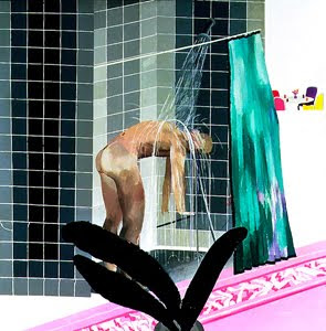
In New York, Hockney befriended Andy Warhol, at whose studio young artists often met and socialized. He also met Dennis Hopper that same night. However, Hockney's main purpose in returning to the States was not to meet peers, but rather to travel to California. Hockney had become fascinated with the images of young, built, and tan men in the publication Physique Pictorial, which he had collected while in London, and he was hungry to experience the sleazy underground world of Los Angeles. He immediately loved the city and made Santa Monica his home. Spending much of his day at Santa Monica pier, Hockney would just people-watch and admire the beautiful boys that seemed to be at the beach every day of the year. This new environment greatly inspired him. In his California paintings, such as Man in Shower in Beverly Hills (1964), Hockney featured mainly wet, sculpted men and typically colorful southern California architecture. Overall, he was enamoured of the more laid-back, sunny lifestyle that the city of Los Angeles provided. It was around this time that Hockney developed the naturalistic, realistic style he is most known for today.
In the summer of 1964, Hockney was invited to teach at the University of Iowa. He was generally bored with this new milieu but was able to complete four paintings in six weeks there. An old friend from London Ossie Clark came to America for the first time and visited Hockney in Iowa. The two traveled across the country a bit, visiting gay bars. At the same time, Hockney hosted his first American exhibition in New York. He received rave reviews and sold every painting.
In December of 1964, Hockney returned to London to give a talk on homosexual imagery in America. A year later, he returned to America to teach at the University of Colorado in Boulder. There he lived in an apartment without windows and painted the Rocky Mountains from his memory. After his term there, Hockney went to California with some old friends. One night in Hollywood, Hockney met the blond beach bum of his dreams, "a marvelous work of art, called Bob," and took him home. The two drove to New York, and Hockney flew Bob out to London, but soon realized that it was a mistake and sent the boy home.
Two years later, Hockney experienced his first true romance with a nineteen-year-old student named Peter Schlesinger. Schlesinger was just about everything Hockney ever wanted in a man. He was attractive, smart, young, innocent, and in great need of Hockney's guidance. Schlesinger became a favorite subject of Hockney's, and the many drawings of him show the informal intimacy of the two. A year later, Schlesinger transferred to Los Angeles from Santa Cruz and moved into an apartment with Hockney. During the day, Hockney would paint, but at night the two would often lie in bed drinking wine and reading. Hockney was very happy. In June of 1967, Hockney took his new beau to Europe, and the two toured the continent. At this time, Hockney's interest in photography grew. He would take endless shots of Schlesinger, mostly for fun, but also for study.
For many years after that, Hockney remained content painting and showcasing his work at various exhibits. His work had gained much esteem and attention all over the world. Critics instantly recognized the power of his art. Most of his paintings from the late sixties and early seventies, particularly Mr. and Mrs. Clark and Percy (1970-1971), adhered to the concept of naturalism -- that is, representing things as they were actually seen.

Malcolm Glover

Malcolm Glover is an independent photographer from Crawley. He was born in 1955 and in 1991 went on and studied photography at Newport for a Diploma in Documentary Photography and MA at Royal College of Art.
Malcolm Glover has exhibited widely, his first exhibition was "Llyn Peninsular" in 1984, which was a study of rural life and toured Wales. He then went on to become photographer in residence at Rochdale Art Gallery, where he was shorlisted for an ICI Foxtalbot Award which took a humourous look at people in health farms. This was exhibited at the National Portrait Gallery and bought by the National Museum of Photography.
From here Glover went on to become artist in residence at the Foley Gallery in Lancaster, where he developed the "timescapes" which now form the body of his work. At present he is working to photograph 30 streets in Britain to show a cross-section of British life. The "timescapes" are 30ft long which allows the viewer to interact with the street as they walk along it.
His first publically acclaimed timescape was of "Brixton Lido" which went on to win him the Year of the Arts award which have enabled him to shoot the streets of Milton Keynes and St Leonards.


The images we exhibited at IPG were Brixton Lido, which is 30ft long and smaller versions of Beadlemead Street and St Leonards, since then he has worked on numerous commissions across Britain using his unique photographic style, which has bought about a series of work including "Shotton Station"


The panoramic images are a form of static tracking shot, giving the impression of a cinematic experience, with the light progressing through the print from morning to night. Traditionally the photographic image has trapped the viewer in one perspective an one moment of time - Glovers work attempts to remove these restrictions.
The "Brixton Lido" image was shot over a six hour period and reveals repetitive behaviour within this period. In "Beadlemead Street", each house in Beadlemead Street was photographed in turn at 45 minute intervals between 9am and 7pm and then "knitted together" to recreate the entire street and the impressions of its hidden life, as with the St Leonards shot.


Sunday 21 March 2010

Week 4 - Joiners, Stitching and Montage

For my 4th week I had planned on using some more studio images which I had taken the week before but in a lesson with Arlo we were taught about photo joiners, photo stitching and photo montages. In the lesson we were shown examples of what the images would turn out like and were then sent off to create our own images using the examples as inspiration. I have decided to do joiners, stitching and montage for my fourth week as I really enjoyed creating the images in class and seeing how they turned out. Looking at the complete images was great and I really liked the effect that taking multiple pictures created. For this week I won't be doing any proper shoots as each image I create will be made up of 30-40 images.
On the next few posts I am going to include other artists work and my own images.

Wednesday 10 March 2010

Modern Monroe

The following images are from my third weeks shoot. The shoot went really well and I got alot of good images. The shoot was done in the college studio and I used a high key set-up for the images. I am happy with the images which I got and I have a good mix of Marilyn Monroe poses and some of my own. This was my first ever beauty shoot and I am hoping to do more in the future. The view the rest of the shoot click here.

Taken: 9th March 2010
I chose this image to upload as I feel that it is a very natural looking beauty shot with not too much posing. To achieve this image I got the model to relax on the floor with the fabric draped over the upper half of her body, I then stood above and to the left of her to get this angle. I feel that this is a very feminine and beautiful shot of the model, I also think that the fact that she is looking straight into the camera creates a connection between the viewer and the model. After the shoot I uploaded the image to my computer and then edited it in photoshop. In photoshop I first removed any blemishes such as spots, moles and freckles to create smoother and more desirable skin. I then increased the saturation on the skin slightly to give the model more of a tan and to give her a more natural skin tone as the lighting and flash made her skin look un-naturally pale. After I sorted out the skin of the model I moved onto the fabric, the fabric which I used was a lighter blue than what it looks like in the image but I increased the contrast of the fabric and then darkened it to give a variety of colours throughout the shoot.

Taken: 9th March 2010
This image I took just after the one above but this time I stood further away from the model but still above so that I could get as much of her body in the shot as possible. I wanted to make this image beautiful and sexual without making it look too much like a saucy image you would see in a lads mag. In this image the model again is looking straight into the camera with a soft gaze which creates a slight innocence to the image. The way in which the model is posed in this image is so simple and, I think, very womanly. You can see the shape and curves of her body yet she has covered up the upper half of herself exposing just a slight part of her stomach and hip. I didn't have to do much to this image in photoshop as her skin wasn't as washed out this time. All that I had to do to this image was remove the blemishes and increase the saturation slightly on both the skin and the fabric.

Taken: 9th March 2010
This image is my favorite of the set. In this image I wanted to try and recreate the colours in one of Bert Stern's images by decreasing the saturation of the model's skin, until it is almost black and white, to make the colour of the fabric stand out further. I feel that the colours work well in this image, and the way that fabric falls down her front and then falls beside her creates a divide between the floor and her body. This stops her body from blending into the floor and makes her stand out more in the image. This time the model is looking off to top camera left in a dreamy way, this makes the viewer think more about the image and what the model is feeling. To create the difference between the model and the fabric I first made two matching layers of this image in photoshop. I then decreased the contrast on the upper layer to create the de-saturated look on her skin, and I increased the satuartion of the layer below to create a brighter looking fabric. I then used the eraser tool on the upper layer and erased the de-saturated fabric so that the bright fabric

Taken: 9th March 2010
To capture this image I told the model to stay in the position as she was before so that I could get an image of her looking back towards the camera. I crouched behind her and got her to look at the camera so that I could get an image from a different than the others. I feel that this image works well in this set as it breaks the images up slightly as it is different, this will stop the viewer from getting bored of looking at the images. The model looks amazing in this shot and I feel that it could easily be in one of todays fashion and beauty magazines. The slight transparency of the fabric helps to cover her semi-naked body yet you can still see her curves which I think is essential in any beauty shot. The models in today's magazines don't look feminine with no curves or breasts and I think it is time that more images, of normal women, like this one are shown in magazines and adverts.

Taken: 9th March 2010
I included this image in the set to show how certain camera angles can be un-flattering. In the rest of the images the model is curvy with a flat stomach and thin upper arms, but because of the angle of the camera in relation to the model this image has given the model a belly and slightly larger upper arms.

Taken: 9th March 2010

Taken: 9th March 2010
To try and get the model to relax more I asked to have fun with the fabric and poses and try and get a feel for modelling in the studio. This worked well as after I took this image and some others like it the model relaxed and the images looked less posed and more natural. I will definatly try this technique again in the future aswell as trying to have a joke and a laugh whilst taking the images.

Taken: 9th March 2010
I definatly captured an image like Bert Stern's, with a Marilyn Monroe pose, but out of all the images in this set I would say that this is my least favorite image. This is because the model looks too posed and slightly awkward in front of the camera. I think this is because this image was taken right at the beginning of the shoot and she wasn't as relaxed as she was further on in the shoot. If I was to do a shoot like this again in the future I would try and get the model to relax before the shoot so that all the images right from the start turned out great.

Monday 8 March 2010

Week 3 - Studio

or my third week I am going to be using the starting point of studio. My shoot is going to themed around Bert Stern's photoshoot of Marilyn Monroe, the last shoot before her death. The photoshoot was done in 1962 and have now become known as the "Last Sitting". Taken during several boozy sessions at the Hotel Bel-Air, the photographs are arguably the most famous images ever captured of America’s most famous actress: Monroe, sleepy-eyed and naked, sips from a Champagne glass, enacts a fan dance of sorts with various diaphanous scarves, romps with erotic playfulness on a bed of white linens. Six weeks after she had posed, Monroe was found dead of an apparent barbiturate overdose. I came across the images whilst looking in a book called "Photo Icons: The Story Behind The Pictures." The following images are my favourite ones from Stern's shoot.

Bert Stern recently re-created these images, with Lindsay Lohan, for a "New York Magazine" photoshoot, which got published on the front cover. What I like about Lohan's images are that she kept her poses and the femininity of the shots the same as the originals whilst making the images seem more up to date and modern. The following images are from the Lindsay Lohan shoot.

The theme of my shoot is going to be based around these images but I am going to be adding my own modern twist to them. The model which I am going to be using for this shoot is Natasha from my tutor. Tash is as beautiful as Marilyn Monroe but has a more modern look and attitude. I am going to be using a see-through fabric like the Marilyn Monroe shoot but i'm going to be using a vivid turquoise colour. I feel that the brightly coloured fabric will give the photoshoot more of a twist whilst the model's make-up and hair will keep the photos feminine.

This is Natsaha the model which I will be using for this photoshoot.

Thursday 4 March 2010

LomoKev aka Kevin Meredith Interview

Whilst looking for more information about the photographer Kevin Meredith I came across an interview which he did just a month after his solo book was released. The following article is the interview which I came across.

"He loves this city, and he shot this city. He even swims in the sea. But for Brighton photographer, Kevin Meredith, it is always about compact film cameras. Kevin, aka lomokev to many Flickr users, launched his first solo book – Hot Shots – last month.

You just had your book launch of Hot Shots last week. How did it go?
It went really well. I think we had about 150 people though the doors. Feedback from the night and for the book has been good. The free booze lasted for over 4 hours so I don’t think anyone can moan!

Is this your first book and what is it all about?
It’s my first solo book. The book is a how-to photography book that is written so that it can be dipped in and out of. Unlike most how-to books, there are no chapters but an image on every other page with a few hundred words explaining how it was achieved. It’s almost small enough to fit into your back pocket and is £10 online so it will make a great stocking filler for any budding photographer.

How did it come about?
The sub editor of the book Lindy Dunlop swims with me at Brighton swim club. She was familiar with my work because I was always snapping shots of us swimming in all weathers. I would send the links round to all the swim club members. I think she delved a little deeper into my Flickr account and thought it would be good idea to get me to write a book for her publishers: Rotovision, which is based in deepest darkest Hove.

How long have you been taking photos?
Since I was 16 so 14 years. I got really heavily into the Lomo thing when I was about 19 and since then I have collected an arsenal of compact film cameras. I never leave my flat without a camera. For the past five years, I have been doing more and more photography work as well as teaching and working in web development

To the cameraphobes out there - what is a Lomo camera? What’s so special about it, and how are you getting on with digital cameras?
The advantage of a Lomo over a camera phone is when you press the button to take a pic - it does not fanny around for seconds, shinning lights and trying to focus - a Lomo will take a picture straight away whether it be blurred or not. I can’t stand the delay in pressing the shutter button and the camera taking a photo. Photography is all about capturing a moment. It’s not good it you are constantly missing that moment! The color you get with film is some much richer than what you would get with a camera phone

I’m going to use the dirty word now...Photoshop. What is your position and will film ever die?
Photoshop is tool like any other - I think the goal for anyone using it should be to make their image not look liked they have not used it at all. As for film, it will always be with us because I think the hardcore will keep it alive, it might become more expensive to buy and develop but it ain’t going anywhere. My favorite film (Agfa Precisa) stopped being produced two years back. I bought up as much as could at the time and still have a large stockpile in a fridge. I found out last week its back in production but its called "Photo Agfa Precisa"

How important is Flickr to you?
I have met so many wonderful people though Flickr , its unreal. My book would not happened without it. I could not imagine where my photography work would be with out it. To me, it’s Facebook with a point to it and without all the poking!

You had your launch at Garage Studios, of which you now teach photography. Did you all meet though Flickr?
Adam Bronkhorst aka The Brownhorse introduced himself to me on the street at the International Beard Championships because he recognized me from Flickr. I got to know him at the Brighton Flickr meet ups. DarkDaze invited me to his photography show at the North Laines gallery with a Flickr mail. The last member of the Garage family, Matt, I met at the studio. He is not very active on Flickr. In fact, I don’t even know his Flickr user name!

You say that you live in and love Brighton, but work up in London. What is it about Brighton that makes you stay?
I sometimes work in London but not a lot anymore. I teach at the university of creative arts in Maidstone and Bucks Uni in Wycombe but mostly I work from home. I used to live in Wycombe, which was dump. I lived in London for two and a half years but there are too many people. Before Wycombe, I always lived in seaside towns, so had to get back to the sea. Brighton seemed like sensible choice

How influential is the city in your work?
I shot this city, I love this city, but I don’t know how influential its been because to that you have to take me out it to see a change and that aint’ happening!

Ok, I’m in Brighton for a weekend and you are my guide. I want to party like it’s 1999, but also want to see the city. Where do you take me?
Friday night we would start in a pub-crawl in the North Laines, then moving though the pubs in Kemp Town - maybe taking in the gay karaoke at the Queens Arms hosted by the lovely Betty Swollocks. We would have to end up at the Concorde 2; no matter what night it is, as they have great variety. There is never a moody or pretentious atmosphere, because of where it is. Everyone who is there, planed to be there, so you don’t get people trying to get in for one last drink. Also it’s a five-minute walk from my house which is handy! In the morning, we would have to go for a swim with Brighton swimming club in the sea down by Brighton Pier, then for a full English at the Dumb Waiter or the Opposition Cafe. Then repeat for your Saturday night.

Are you going to be holding more exhibitions in Brighton and where else can we see your work?
After I get married, I am going to start planning some new exhibitions and projects. There might be a Manchester Hot Shots launch in December - if I can get it together."

Kevin Meredith

After doing my photoshoot on Vernacular Signage I asked my lecturers if there were any photographers which specialize in Vernacular Signage. The photographer which came up was Kevin Meredith, an english photographer from Brighton. For Meredith his photography is all about using compact film cameras. He recently brought his first solo book named "Hot Shots" and in the book are a few images of Vernacular Signage. The following images are a few from the book.


Tuesday 2 March 2010

Urban Vernacular Signage

For my second week of images I have taken pictures of Vernacular signs in my area. Three of the images were taken in Redruth, Barncoose Hospital in the early evening and two were taken around Truro in the late afternoon. All of the images were taken on a Lumix G1 and the exposure varied for each of the images. The following images are my favourite images from the shoot which have been edited for this blog. To see the rest of my shoot click here.

"10 MPH"
Taken: 28th February 2010
This first image was taken on the first day of shooting. It was taken at Barncoose Hospital and was taken near the end of the shoot just before the sun set. I took an image of this sign because I liked how worn out the edges of the sign were. After the shoot I opened the image on photoshop and adjust the saturation of the red so that the edge of the sign seemed more worn out. I also desaturated the background and increased the contrast of the sign so that the sign would stand out more from the background. I think that this image works well as 90% of the image is taken up by the sign which makes it stand out more. There wasn't any direct lighting on the sign as it was in the shadow of a building. I believe it works well without direct light as if there was any light shining onto the sign there would be a glare and it wouldn't look as old and distressed.

"Don't Enter"
Taken: 28th February 2010
I took this image on the way back from the photoshoot, I took this picture as it caught my eye as I walked past. I felt that there was some irony to the image as the 'No Entry' on the sign is actually in front of an entrance to a hospital yard. I also liked how the red stood out from all of the dull greens and browns surrounding the sign. Once I had uploaded this image I went into photoshop and de-saturated the colours around the sign to make the red stand out more in the frame. When I was taking this image I wanted to make sure that the viewer could see the irony that I could when taking the image. I made sure that you could see the entrance and the yard in the background but at the same time I didn't want to much of it showing as that would complicate the image, which would make the image less visually appealing.

"Clean It Up"
Taken: 1st March 2010
This image is my favourite out of the five which I have posted. Whilst walking around the residential areas of Truro I came across alot of these signs and I took photos of about 5 or 6 of them. Some were very new and had no signs of damage whereas, like this one, there were a few which were weather damaged and broken. I chose to use this image on my blog as I liked how the sign has become damaged, the sun has faded the yellows and reds and dirt and grim has made the edges grimey and darkened. Once the image was uploaded to the compture I put it into photoshop to edit. The first thing I did was de-saturate the image to give it a darker and more damaged look, I then increased the contrast as when I de-saturated the image the colours seemed flat and the image didn't seem as visually appealing. I feel that this image works well as the sign in the middle stands out from the background but at the same time doesn't seem out of place in comparison to the rest of the image.

"School Time"
Taken: 1st March 2010
This image is probably my second favourite out of the five images that I have posted. The reason which I like this image so much is because the sign stands out so much from the background. When I took this image there was already a contrast between the sign and the background but I edited this image in photoshop before I uploaded it to the blog as I wanted to create more of a contrast between the two. The first thing that I did in photoshop was desaturate the bush in the background to try and make the sign stand out more, after doing that I still felt like the sign needed to stand out more so I slightly saturated the red on the sign. I feel that this makes the images more appealing and makes it seem less flat, like it was before. I think that this image is successful as the triangular shape of the sign takes up the upper half of images but is slightly to the left of the frame which makes it not seem as perfectly set out in the frame.

"Around And Around"
Taken: 28th February 2010
Out of all the images which I chose to put on the blog for this shoot I would say that this is my least favorite of the five. I took this image on the first day of the shoot and it was one of the first images which I took. I chose to add this image to the set as it gave a nice contrast to the other four images. This is because the other images have duller and more de-saturated tones to them yet this image is vibrant which makes it stand out from the rest. The part of the image which I like the most is the sky as it starts off darker at the top of the frame but as you look down the image the sky gradiates to a lighter blue. Once I took this image I uploaded it to my computer and then opened it in photoshop to make a few small changes. The only things which I changed was I cropped the image slightly at the edges to centre the sign more and then I up the saturation of the blue to make it stand out more. I feel that this is a good image as the pole creates a good leading line which draws you up to main part of the image, the sign.

When taking these images I wanted to try and capture the variety of different signs which we can see in our everyday life but don't pay much attention to. I feel pleased with the images which I have managed to create and hope to try and do another shoot like this in the future.

Monday 1 March 2010

Week 2 - Land

For my second week of images I am going to be using the starting point of land. My first photoshoot is going to be of signs in the urban land. My inspiration came when I was browsing through deviantart at miscellaneous urban and rural images. So far I haven't found an particular artist which specializes in signs in the urban land but I have found a few images which I find inspirational.